
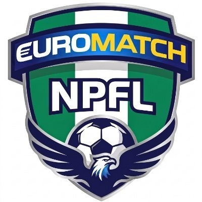
The Nigeria Premier Football League, NPFL, has unveiled a new logo as the competition begins a fresh chapter in its branding and commercial development.
The new identity was unveiled on Wednesday at the Abuja Continental Hotel in Abuja. Key stakeholders in Nigerian football and representatives of the league’s new commercial partner, Euromatch, attended the event.
The unveiling comes shortly after Euromatch became the official title sponsor of the NPFL. The partnership forms part of the league’s wider plan to strengthen its financial base, improve brand visibility, and make the competition more attractive to fans and corporate partners.
The new crest gives the league a modern look while retaining strong links to Nigerian football and national identity. Its design combines the colours of the Nigerian flag with symbols that represent strength, pride, speed, and football.
NPFL Logo Reflects National Identity and New Commercial Era
The logo uses a traditional shield or crest shape with a silver and grey outline. That structure gives the badge a strong and professional appearance while representing the strength and protection associated with the league.
Green and white stripes form the background of the crest. The colours mirror Nigeria’s national flag and reinforce the NPFL’s identity as the country’s premier domestic football competition.
At the top sits a curved blue banner carrying the Euromatch name. The word EURO appears in white, while MATCH appears in yellow. The prominent placement reflects Euromatch’s new role as the league’s title sponsor.
At the centre, bold white letters spell out NPFL with a navy outline. The lettering remains the main focal point of the crest and clearly identifies the Nigeria Premier Football League.
A classic black and white football sits beneath the NPFL lettering. Behind it, a navy blue eagle spreads its wings, with its head facing right.
The eagle draws from Nigeria’s national sporting identity and recalls the Super Eagles. Its presence represents power, speed, ambition, and national pride.
Small touches of light blue and white add detail to the eagle. Together with the green, white, navy blue, yellow, and silver elements, the colours give the new badge a modern and premium feel.
The overall design aims to communicate four key ideas: national identity, professionalism, commercial growth, and football. The Nigerian colours and eagle highlight the league’s national roots, while the clean crest and bold lettering give it a more polished appearance.
The Euromatch integration also reflects the commercial direction of the rebrand. The sponsor’s presence at the top of the crest places the new partnership at the heart of the NPFL’s latest visual identity.
The new logo was unveiled as part of the league’s transition into the Euromatch era. NPFL Chairman Gbenga Elegbeleye has previously highlighted the importance of the new commercial partnership as the league seeks to build a stronger future for Nigerian football.
Beyond the logo itself, the rebrand forms part of broader efforts to improve the organisation, marketing, presentation, and public image of the competition. The league hopes the refreshed identity will create a stronger connection with supporters while giving commercial partners greater visibility.
The Euromatch partnership also provides the NPFL with an opportunity to attract more corporate investment. Stronger commercial backing could help the league improve its operations and create greater value for clubs, players, and supporters.
For fans, the new badge represents more than a change in design. It signals a new phase for the competition at a time when the NPFL continues to seek greater recognition, stronger commercial support, and wider engagement.
Attention will now shift to how the new partnership and branding translate into practical benefits. Fan engagement, club development, player welfare, match presentation, and the overall quality of the competition will remain key measures of the new era.
With Euromatch now attached to the league and a refreshed logo representing its new direction, the NPFL has placed commercial growth and stronger branding at the centre of its next chapter.